Create a single line time series graph in a dluhc theme for a line which has a predicted/forecast value
forecast_timeseries.RdCreate a single line time series graph in a dluhc theme for a line which has a predicted/forecast value
Usage
forecast_timeseries(
  .data,
  datecol,
  ycol,
  cutdate,
  dateformat = "%Y-%m-%d",
  dottedline = TRUE,
  label_names = c("Recorded", "Forecast")
)
Arguments
- .data
A dataframe in long format with 2 columns necesarry: Date and value
- datecol
The column name which contains the date value in a widely used date format
- ycol
The column name which contains the values
- cutdate
The date which the predicted values begin from
- dateformat
The format which the date is presented in using the standard R date format, see here for more detail https://www.statology.org/r-date-format/
- dottedline
A TRUE/FALSE statement to decide if you want a vertical dotted line on the graph to split the prediction and the recorded values
- label_names
A vector containing the 2 words you want as the label for your lines, the default is c("Recorded", "Forecast")
Examples
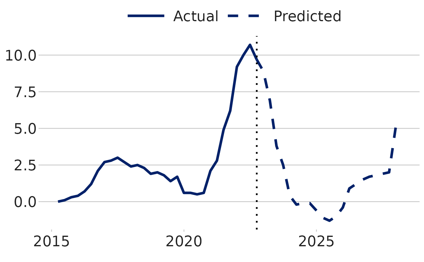
df <- dluhctheme::OBR_Forecast
forecast_timeseries(df,Date,ycol=Inflation,cutdate = "01/10/2022",dateformat = "%d/%m/%Y", label_names = c("Actual","Predicted"))